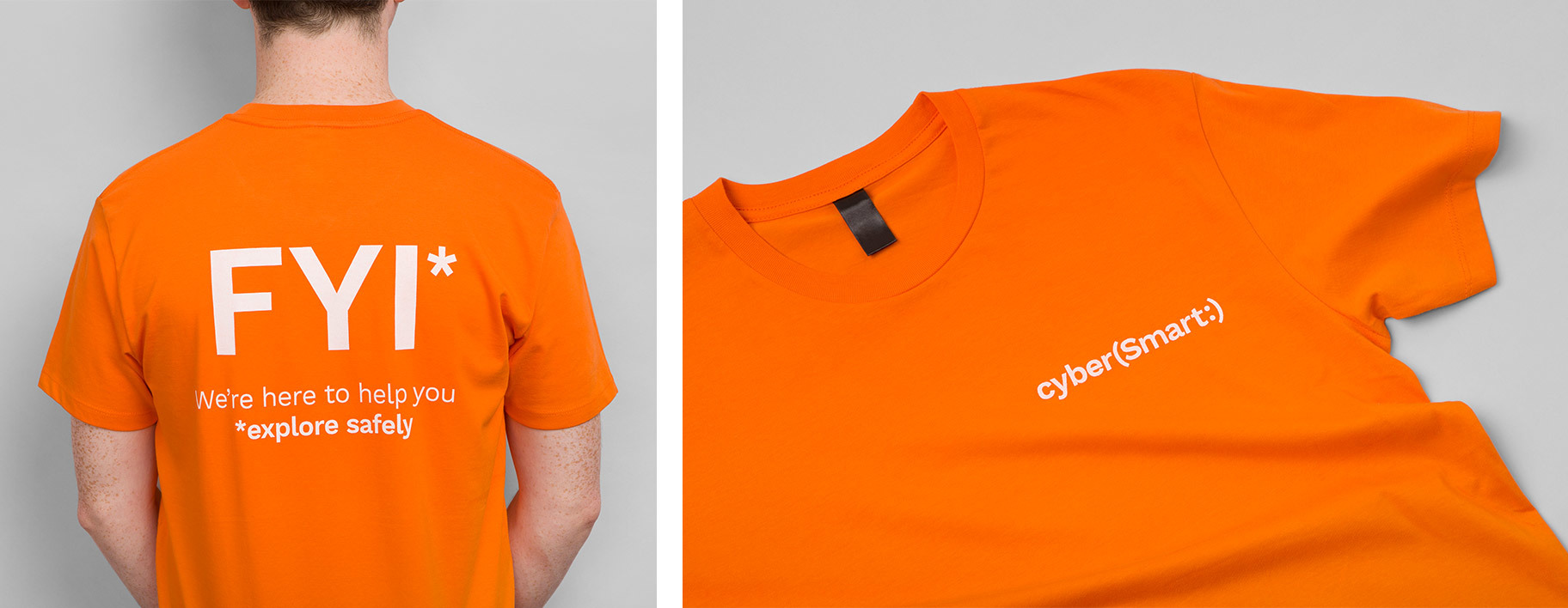
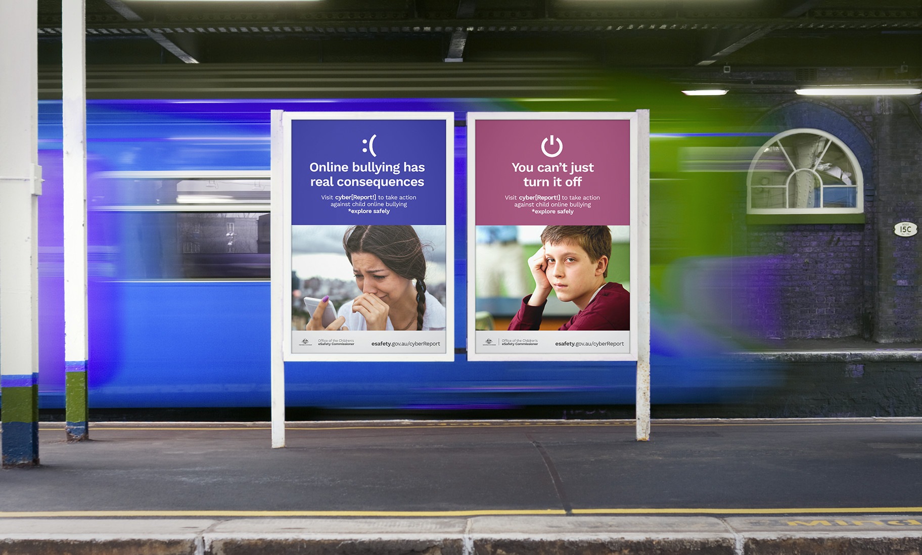
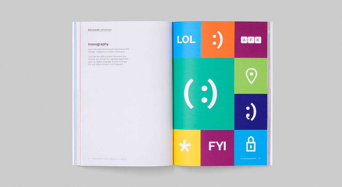
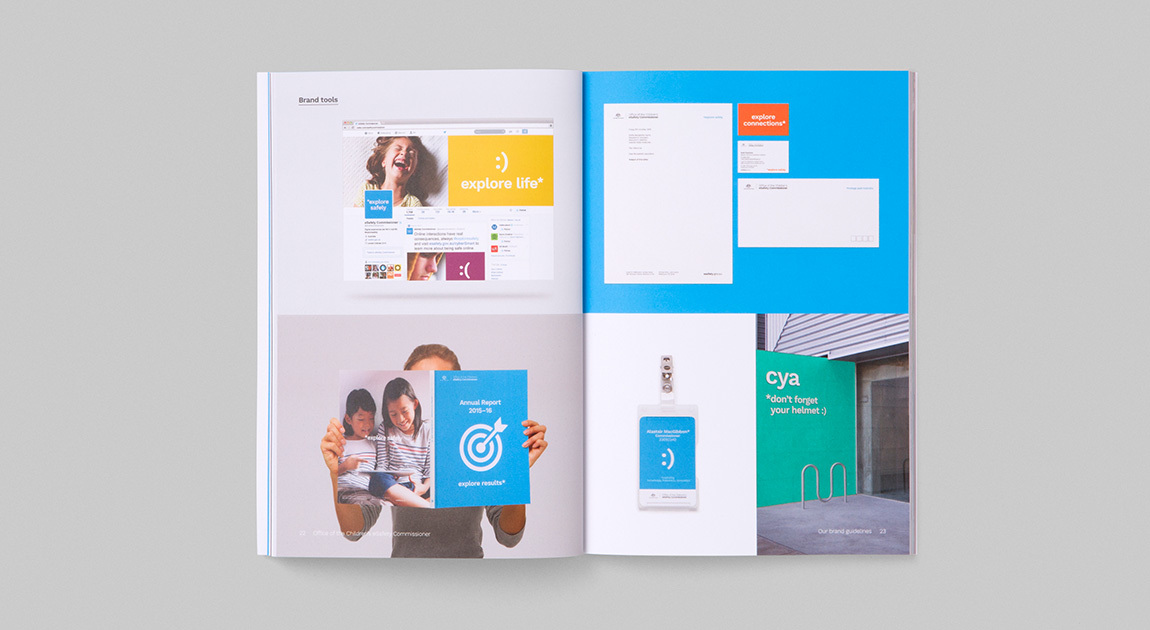
With the growing digital landscape, we all have a digital life where we experience a vast amount of interactions. The Office was formed by the Australian government to pioneer a safer, more positive internet experience for our young Australians, and in its start up they required a strategy and brand to engage Australians. Enter Aer Design. Through workshops, interviews and research we unearthed key insights and distilled a strategy that would empower Australians to explore the online world, safely.
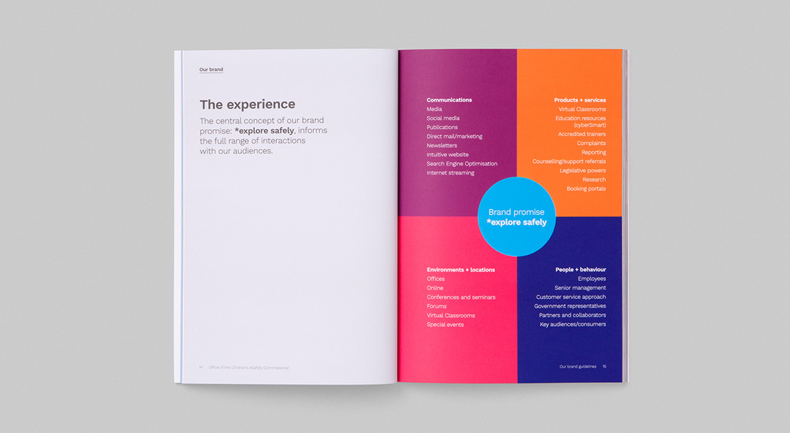
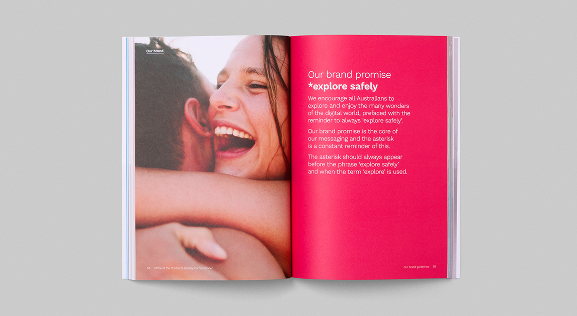
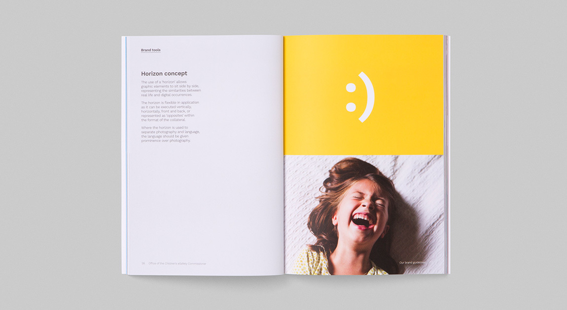
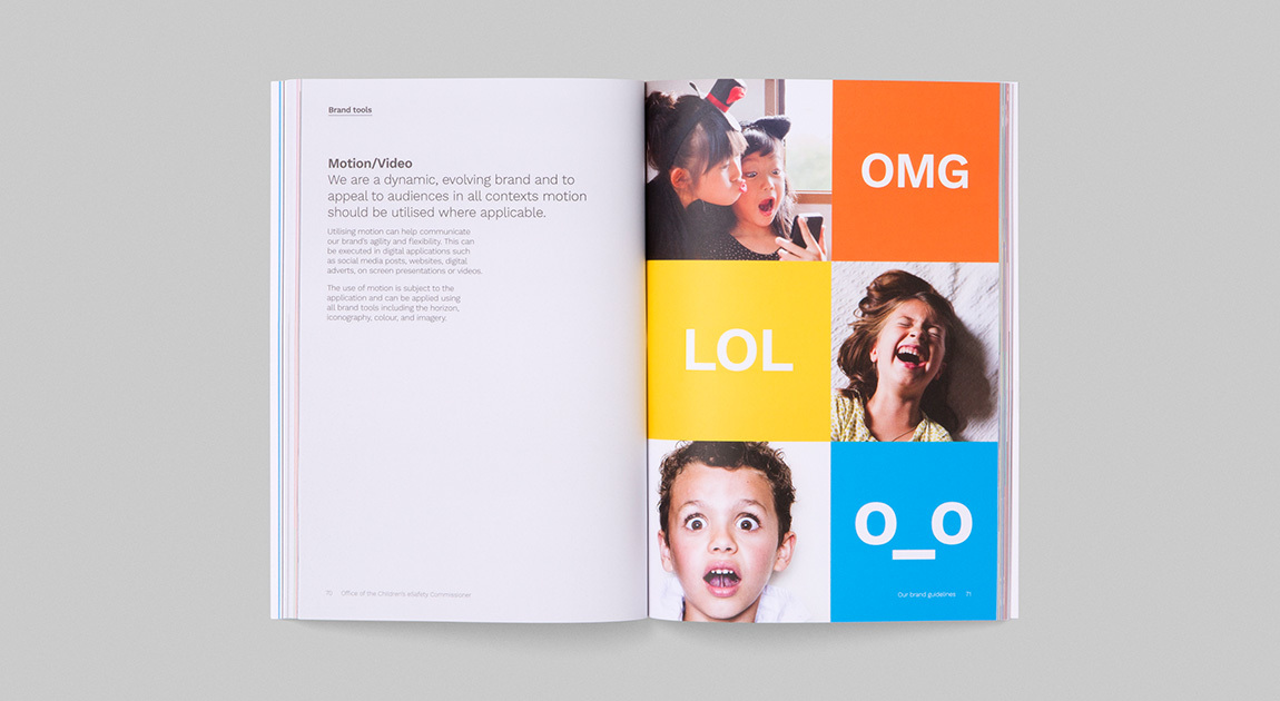
Being online is inevitable, but being safe online is about being informed, and the brand developed parallels real life with digital life to demonstrate the idea that digital experiences are real—being safe online is just as important as being safe in life. Every brand touchpoint of the Office champions the ethos of safe exploration.
Client
Office of the Children's eSafety Commissioner
Services
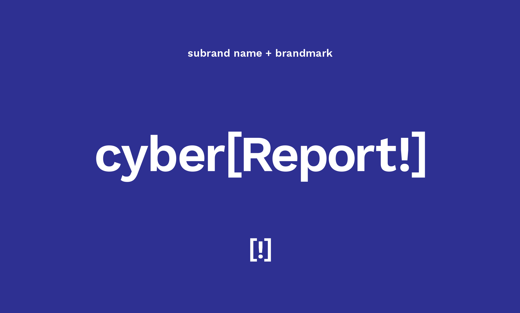
Brand workshop—Strategy + positioning—Brand architecture—Naming—Identity—Campaigns—Corporate communications—Marketing collateral—Digital marketing—Copywriting—Art direction—Animation
Recognition
Finalist—AGDA Awards 2016—Identity (Identity Manuals)
Creating a cohesive strategy and consistent brand story for the office to reach over 59,000 Australian children in a year was essential.
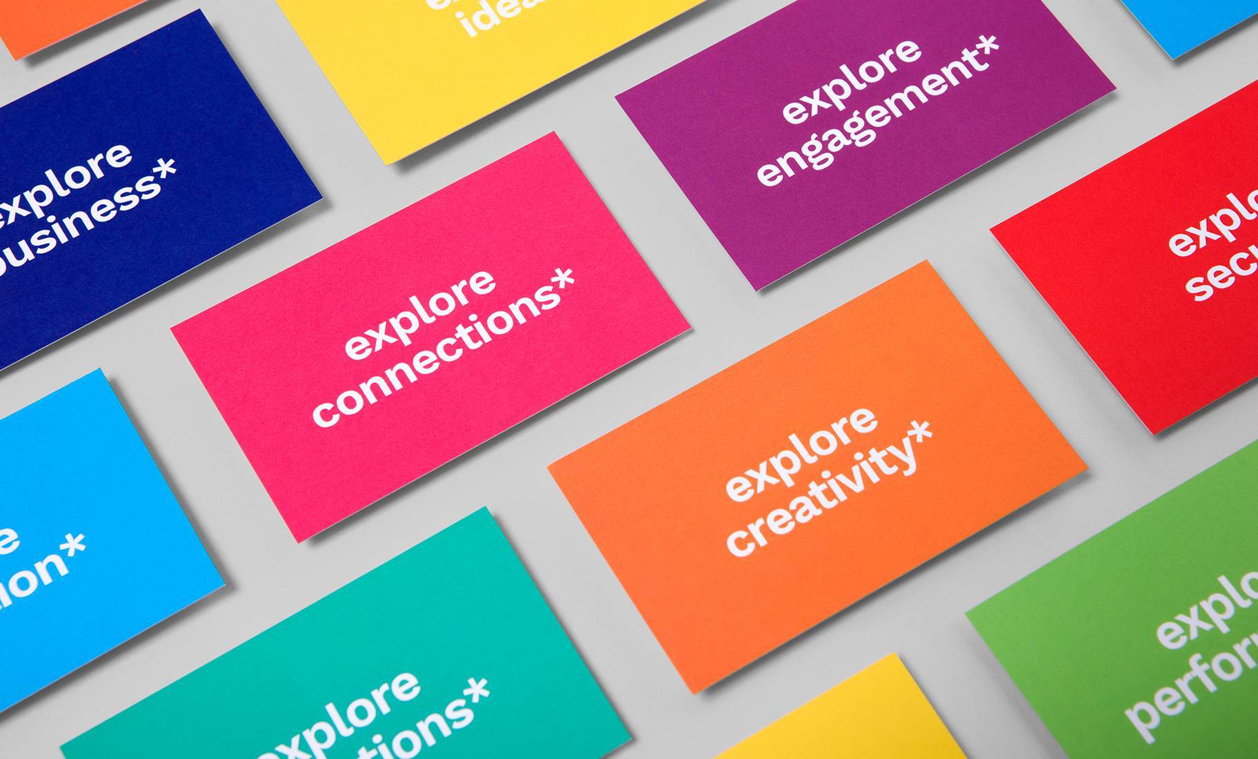
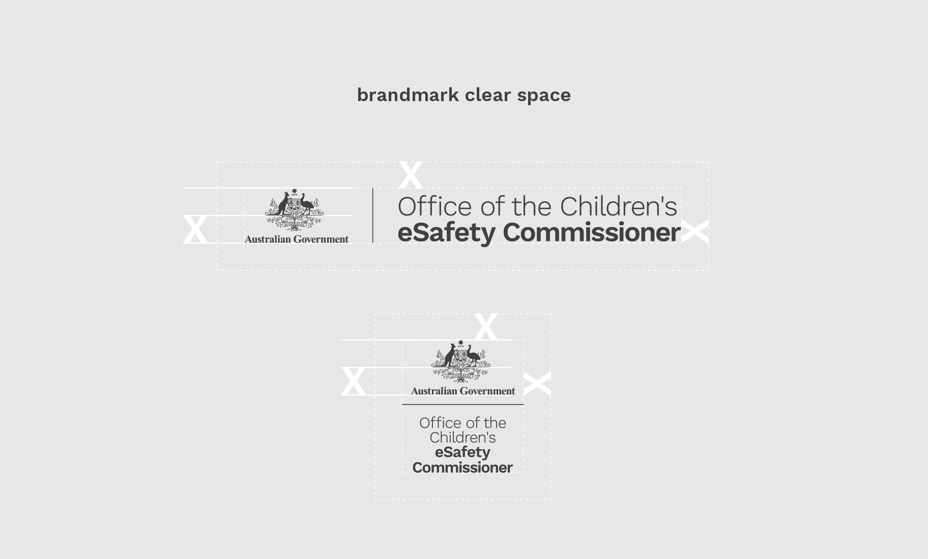


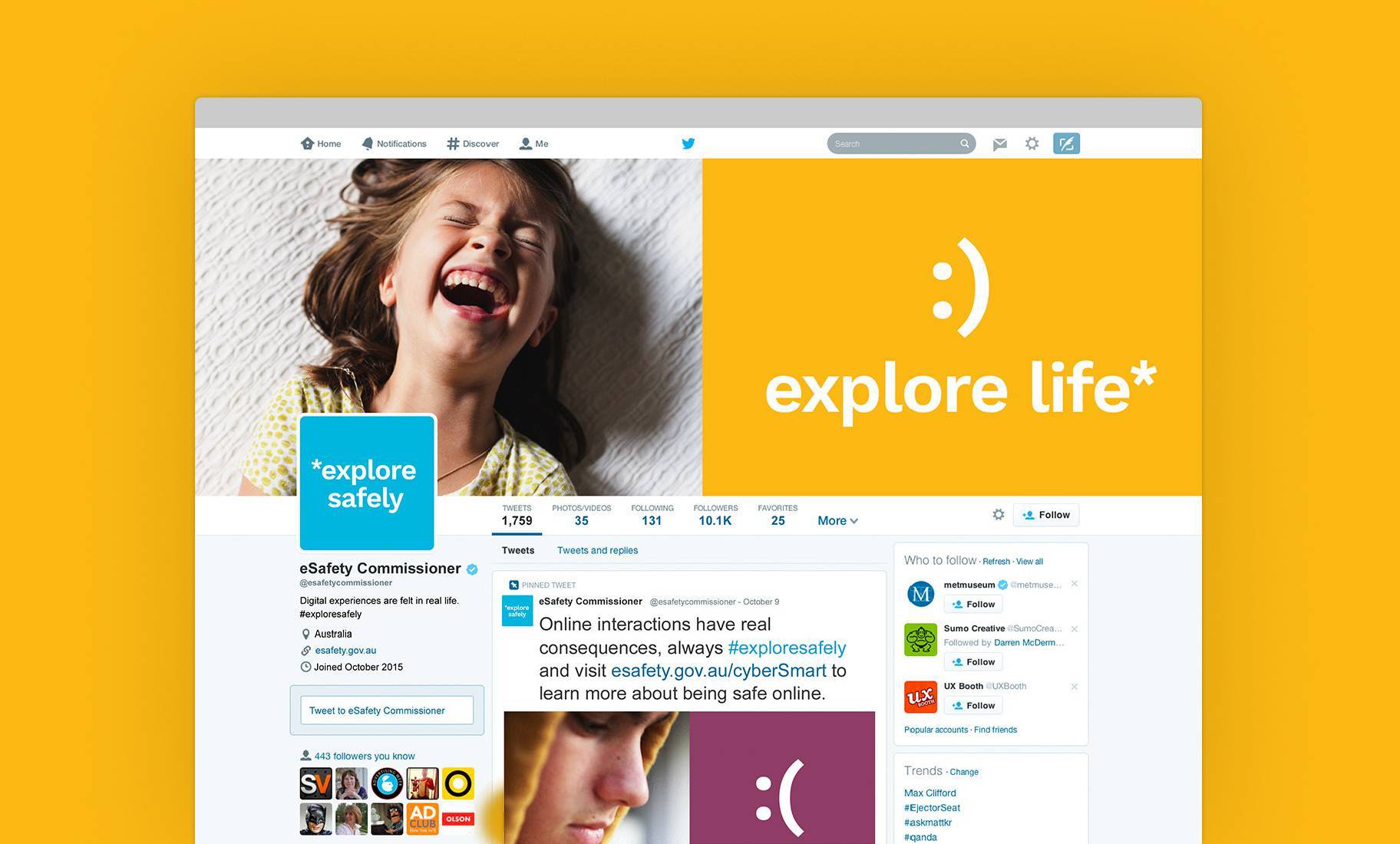
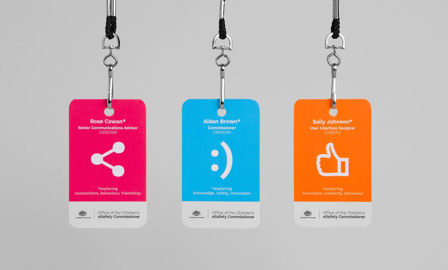
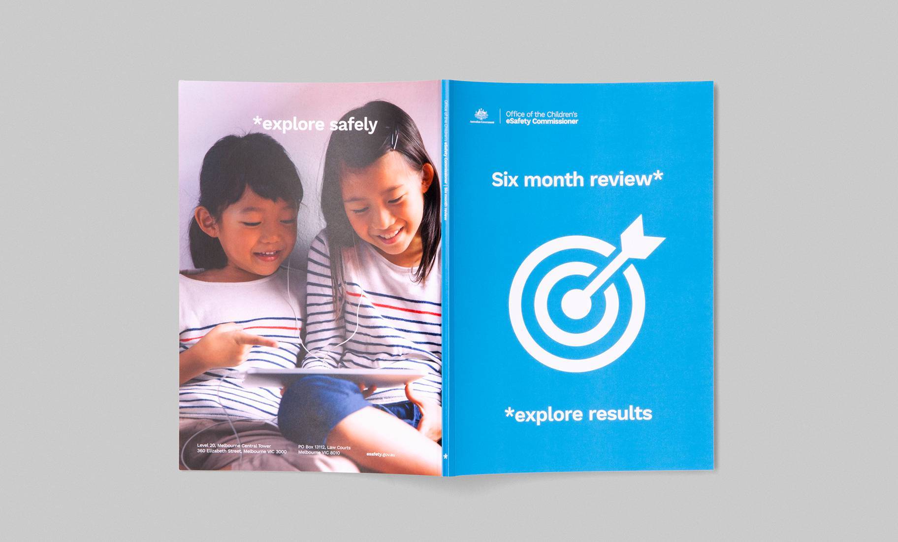
Existing programs were brought under the Office umbrella, sitting seamlessly with the new brand.

